MadFish Prosecco
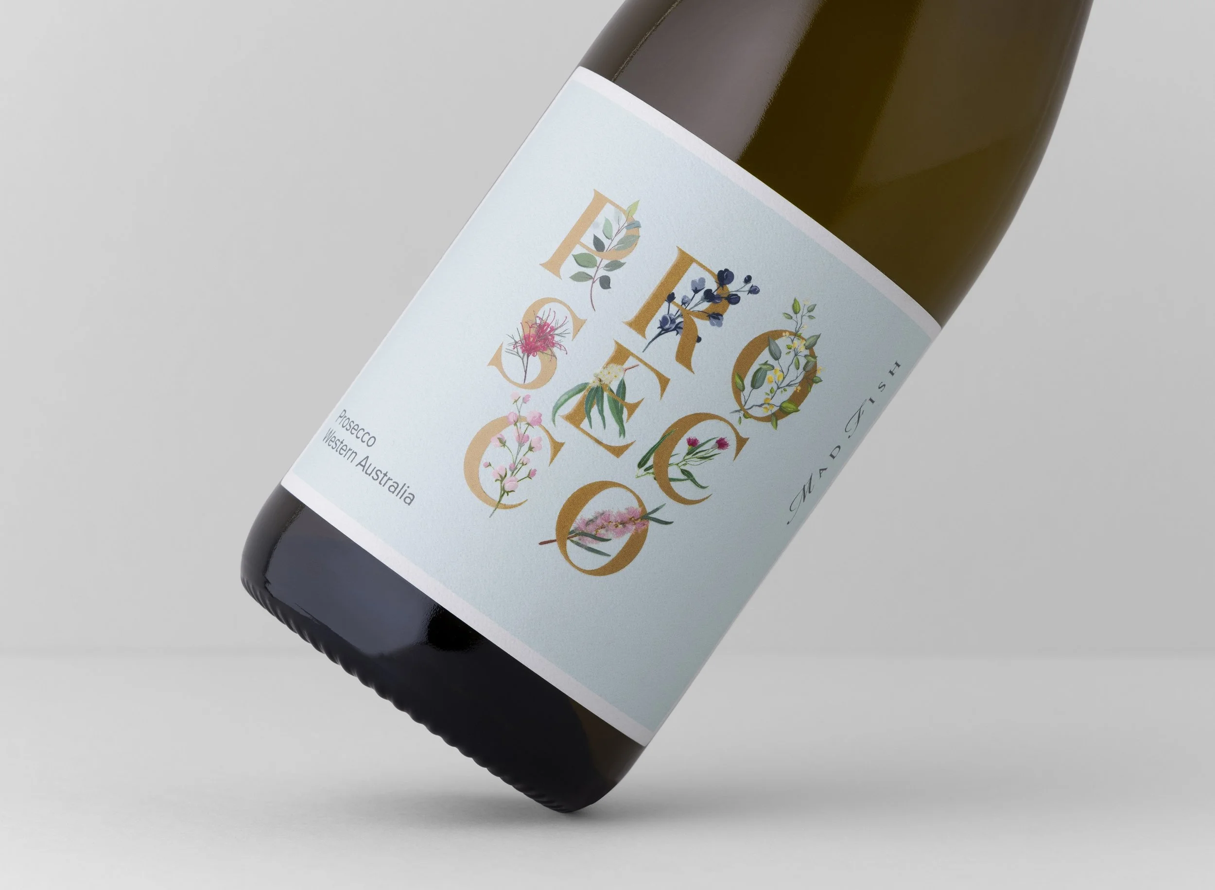
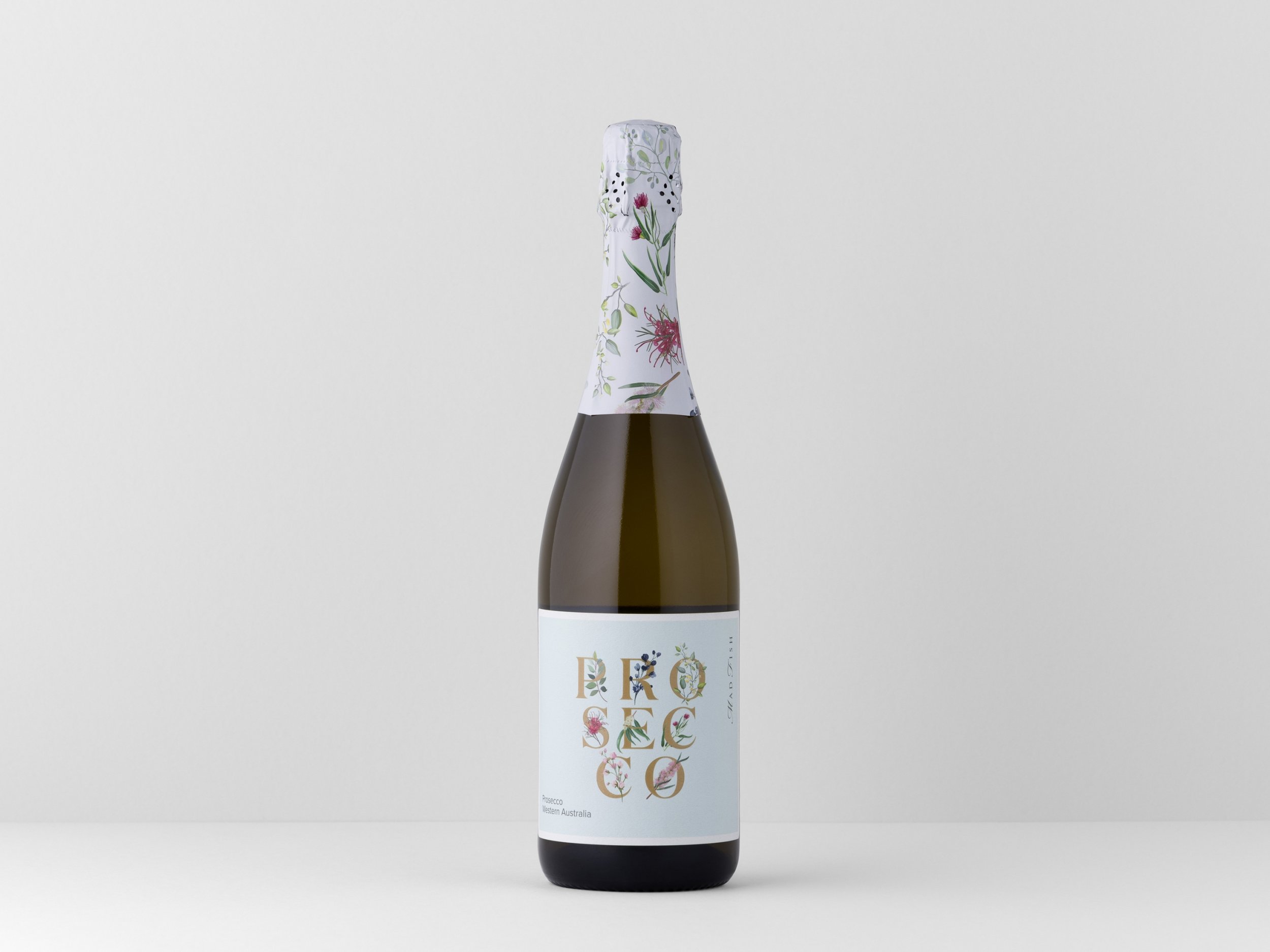
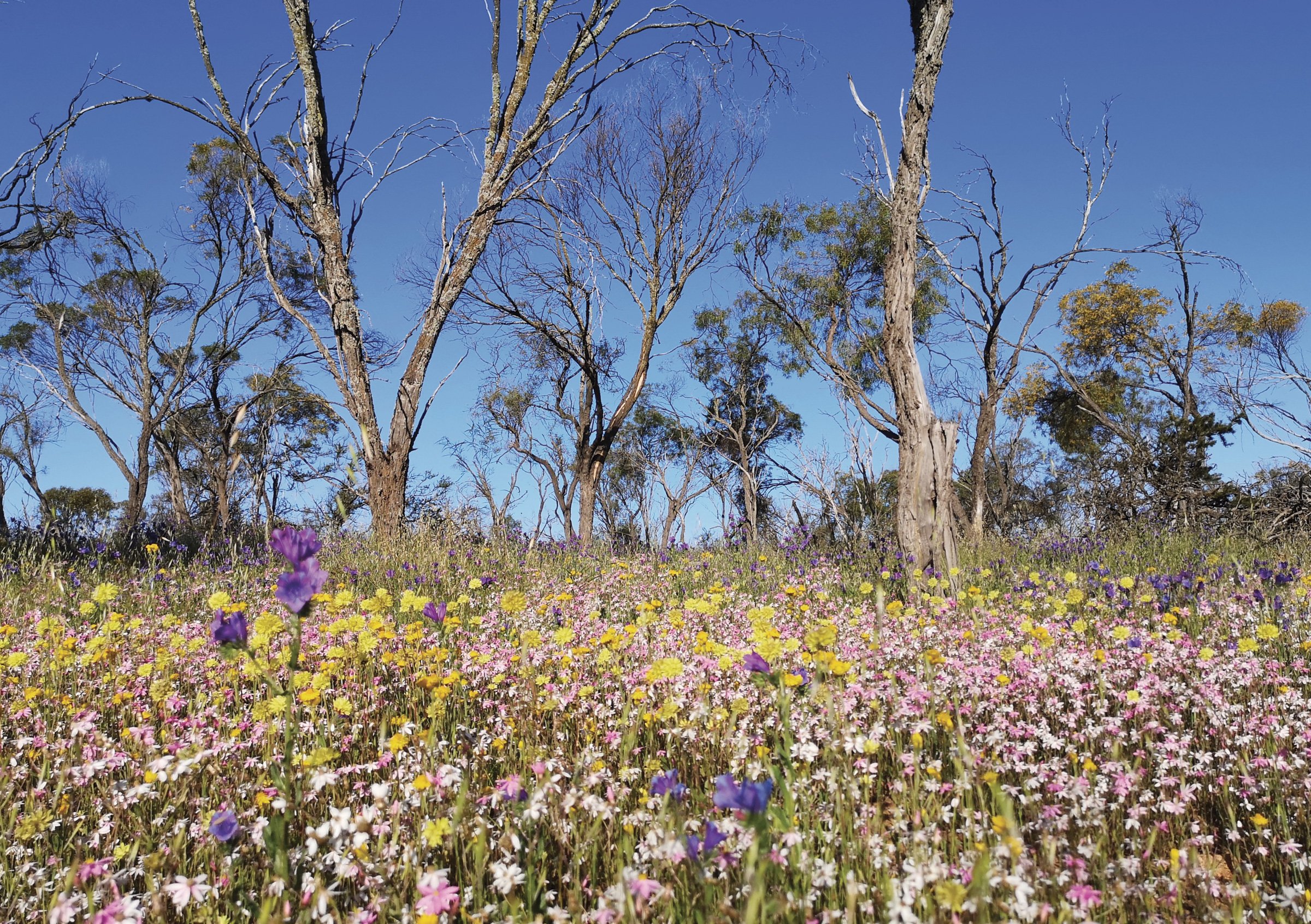
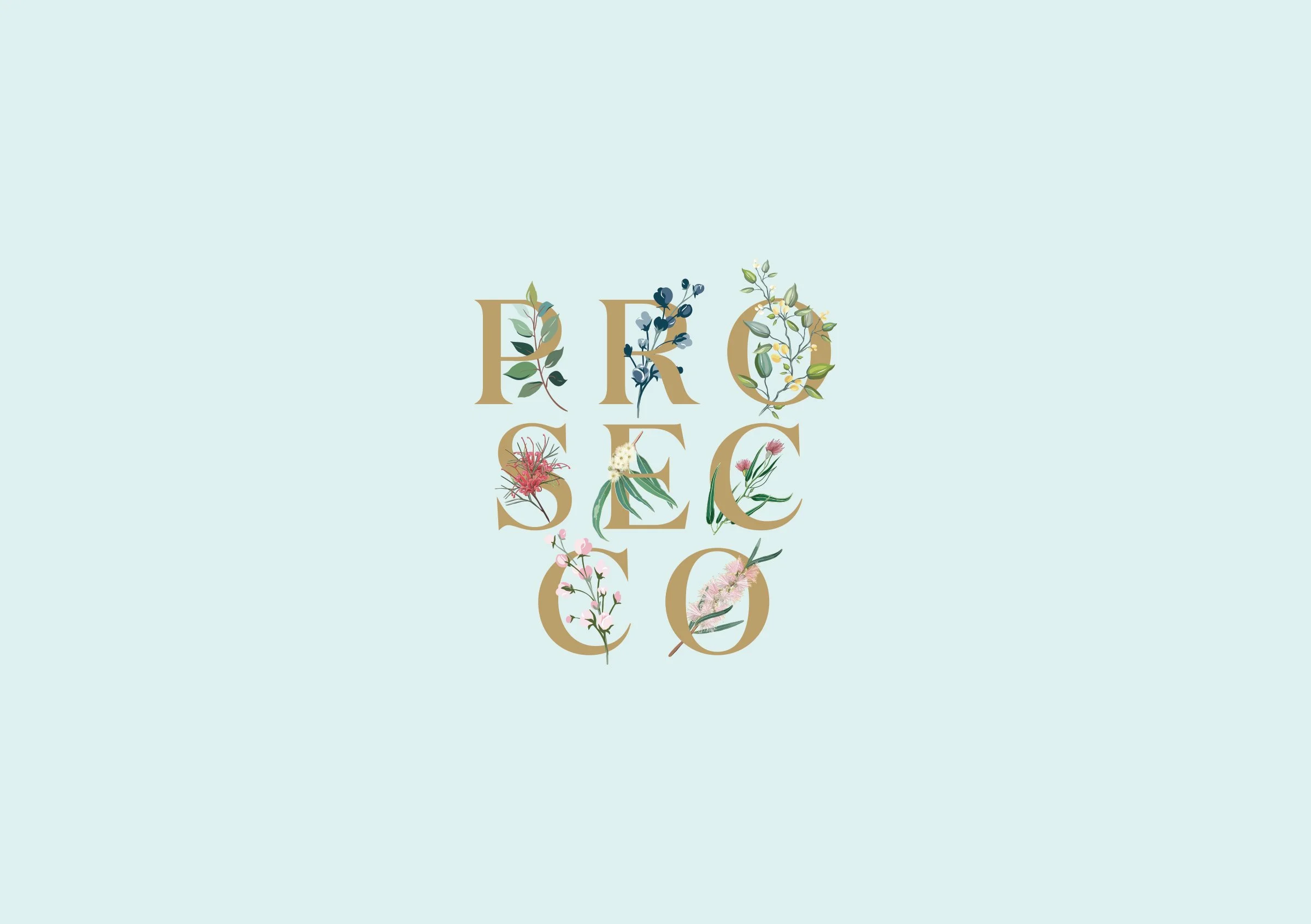
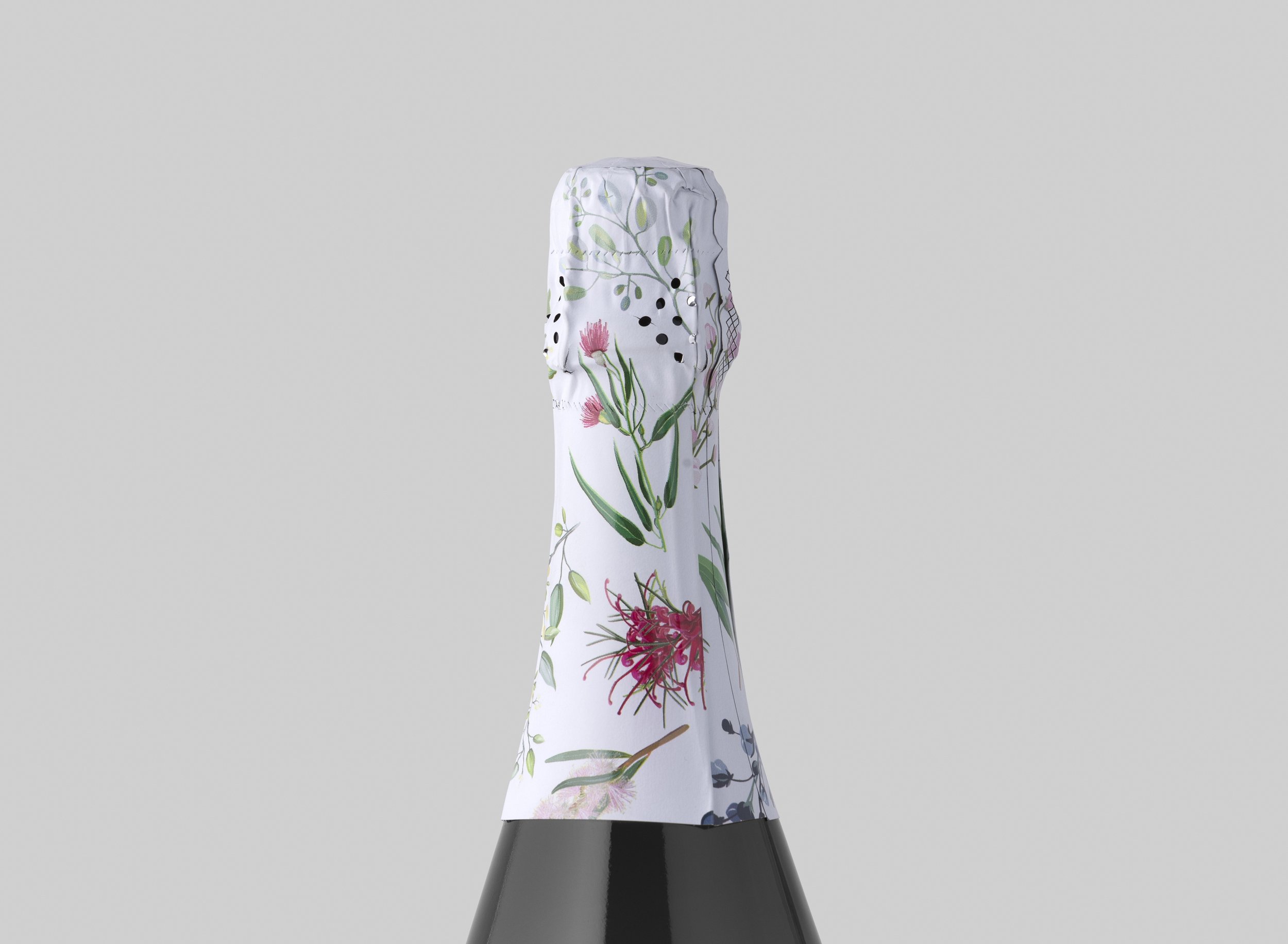
Sitting outside of the main MadFish style, this prosecco product from Burch Family Wines had to have its own styling and shelf appeal. We chose to hero the typography of the product name and decorate it with a range of delicate botanicals, that our found in the South-West of Western Australia. The real challenge was in mirroring the illustrations on the hood. The artwork was meticulously setup so that the pattern married up when wrapped around the neck of the bottle in production. The effort was worth it, creating a cohesive enclosure that is eye-catching and unique.
The product has been well received in the market, increasing sales by 400% or more.
Bronze Skull - Perth Advertising and Design Club Awards 2021