Beck + Call
Beck + Call required a refresh of their packaging that called out their points of difference and helped them push back against other coffee brands in the Australian market – they didn’t want to play it safe anymore. The package needed to speak to the small producer's commitment to quality coffee and the science of roasting the perfect bean.
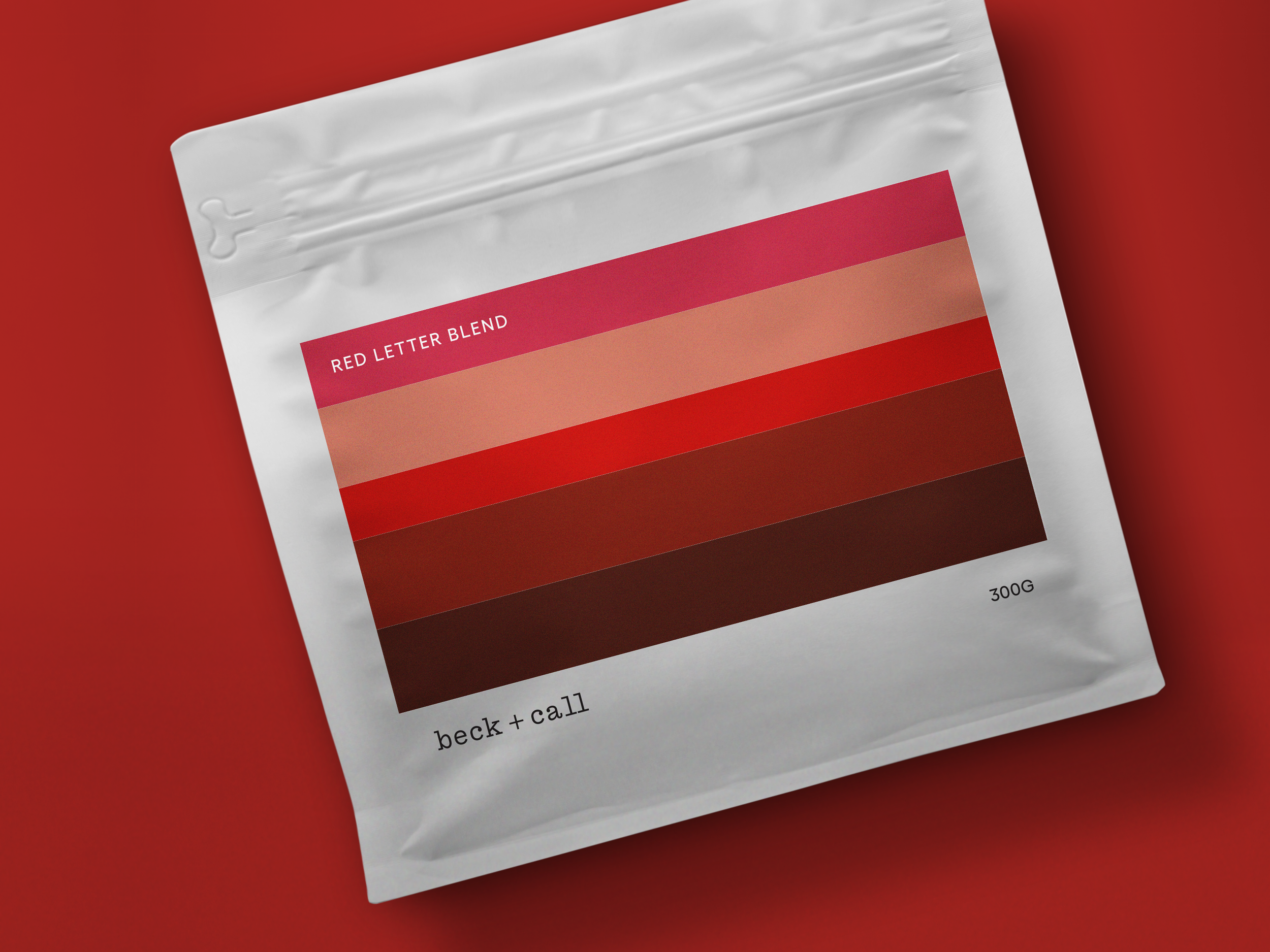
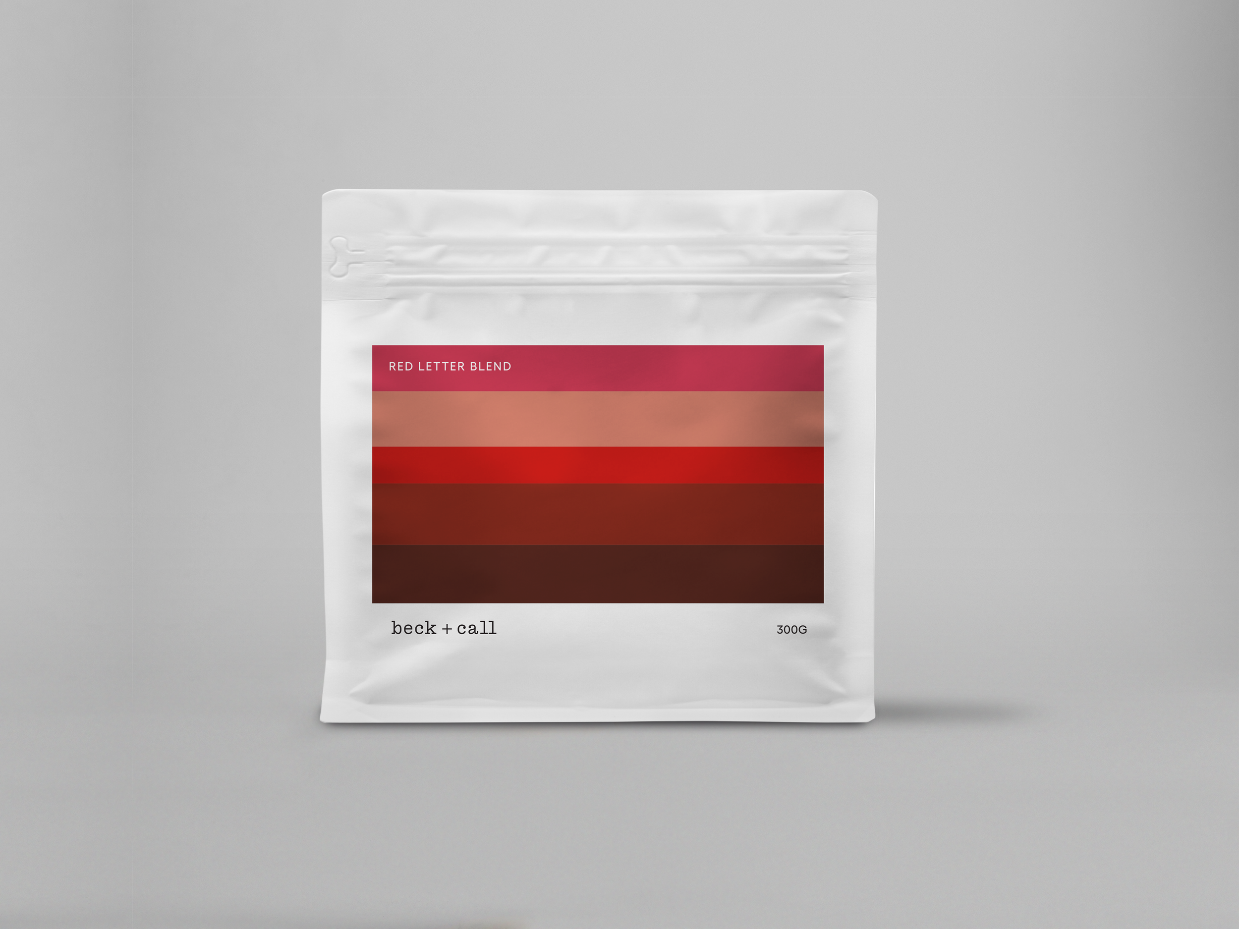


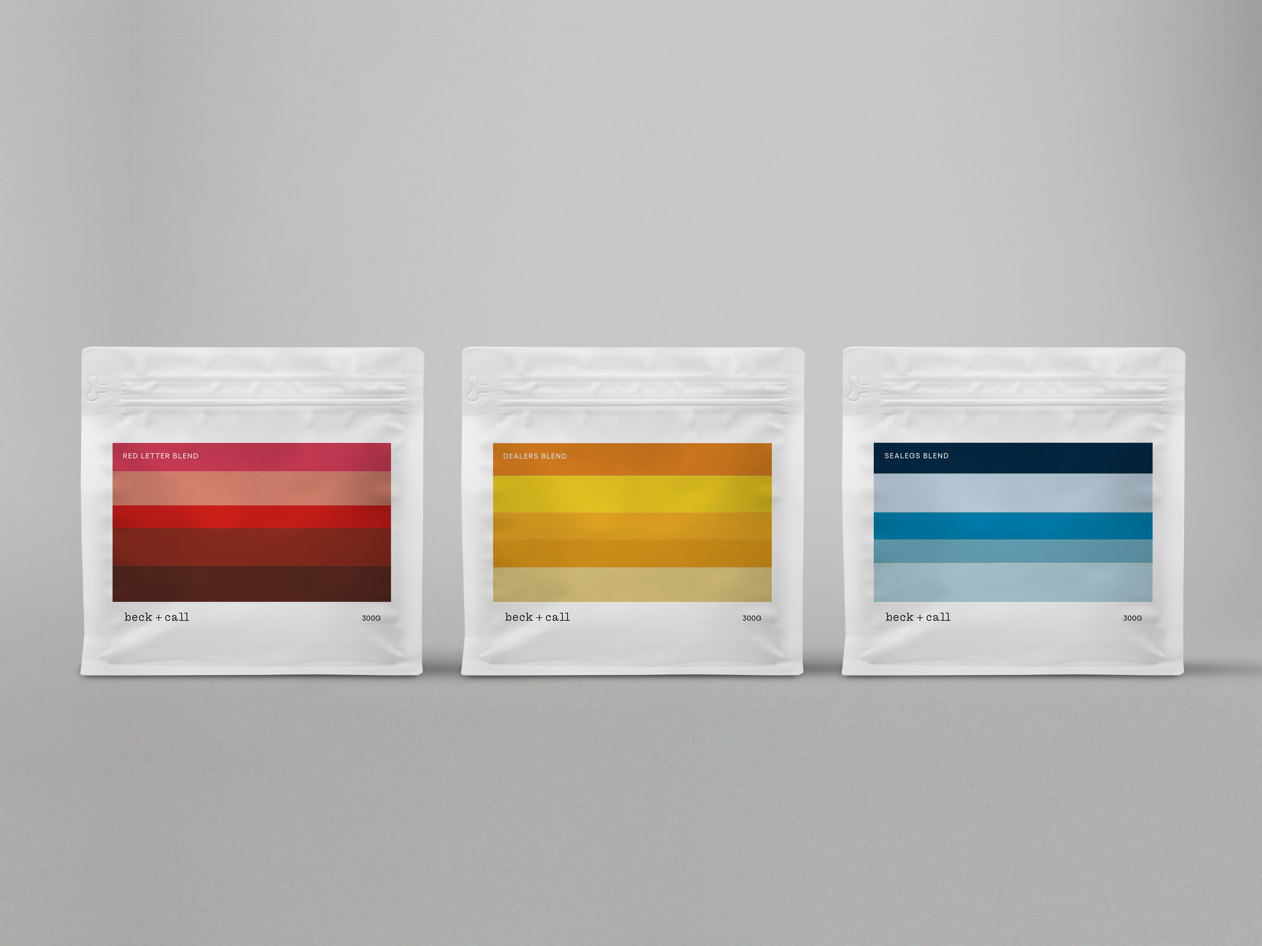


We got the client to rate their coffees against five key quality indicators. This provided us with unique data that was used to create vibrant infographics that are unique to each blend and single origin. The artwork references the landscape, flora and fauna while providing a guide to the flavours inside the bag. The labels are both practical and beautiful if we do say so ourselves.