Higher Plane
Higher Plane have been making quality wines from innovative grape varietals for years but had always played it safe from a label design point of view. The label had an H that concealed an arrow but it didn't communicate the fresh ideas and flavours behind the wines or the personality of the winemakers. It was time for a freshen up.
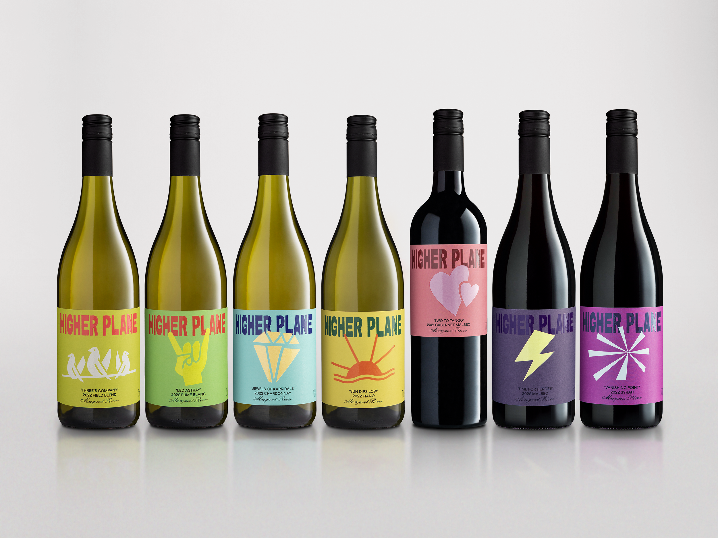
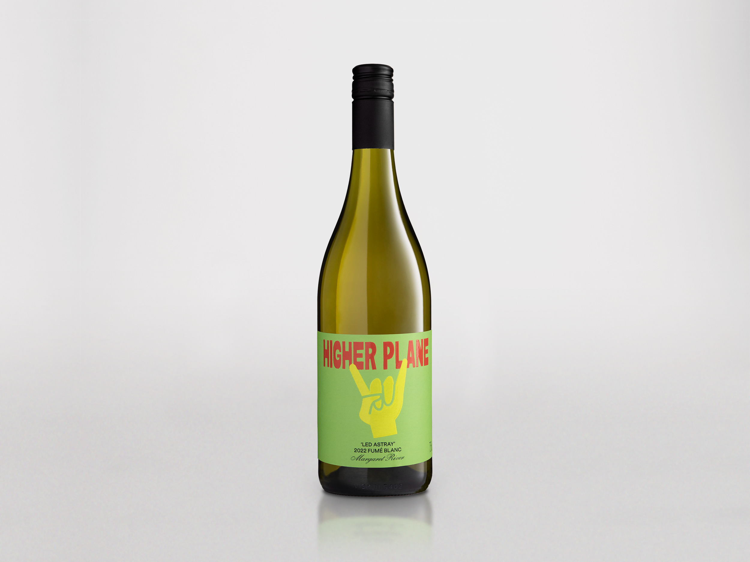
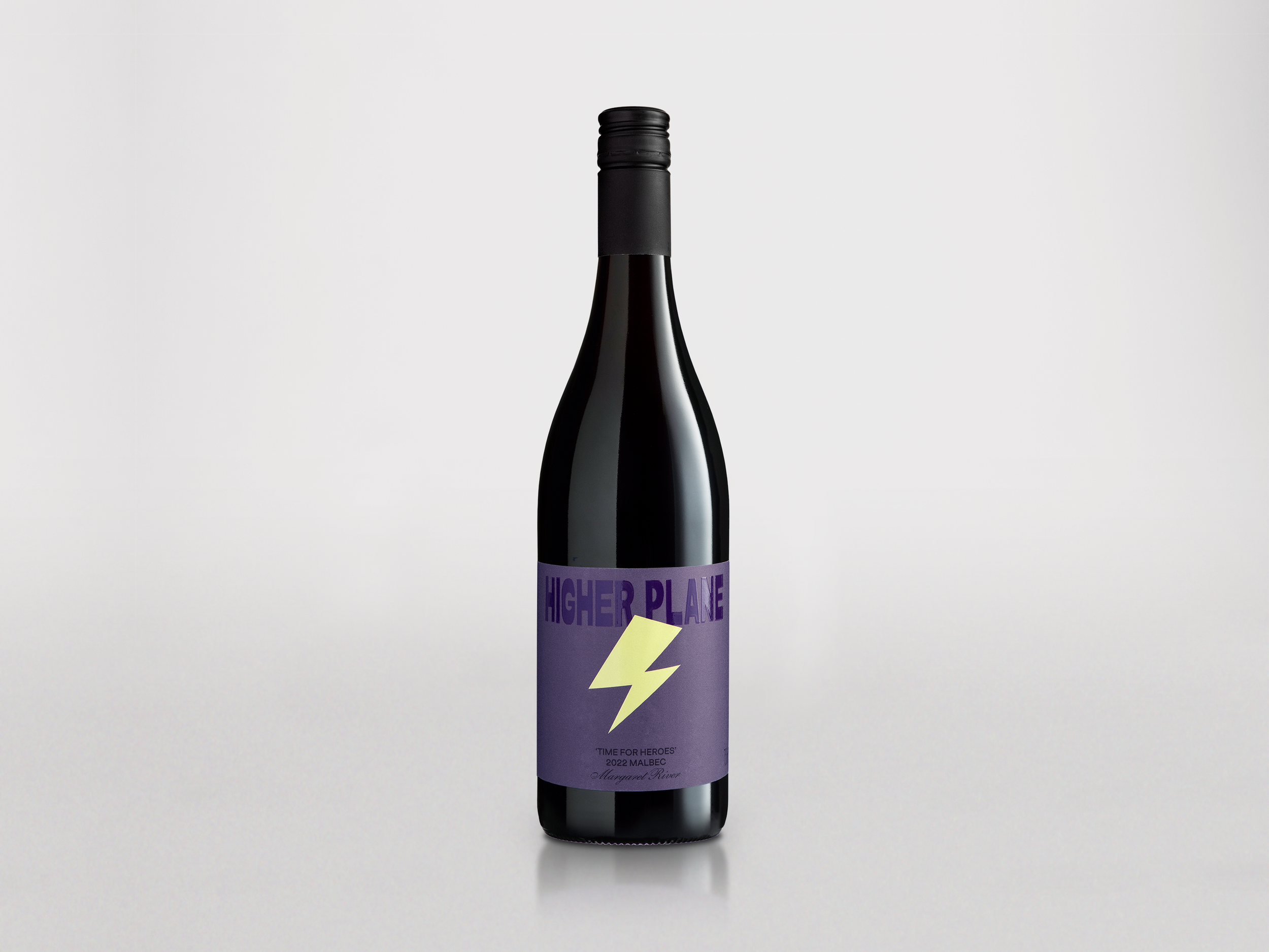


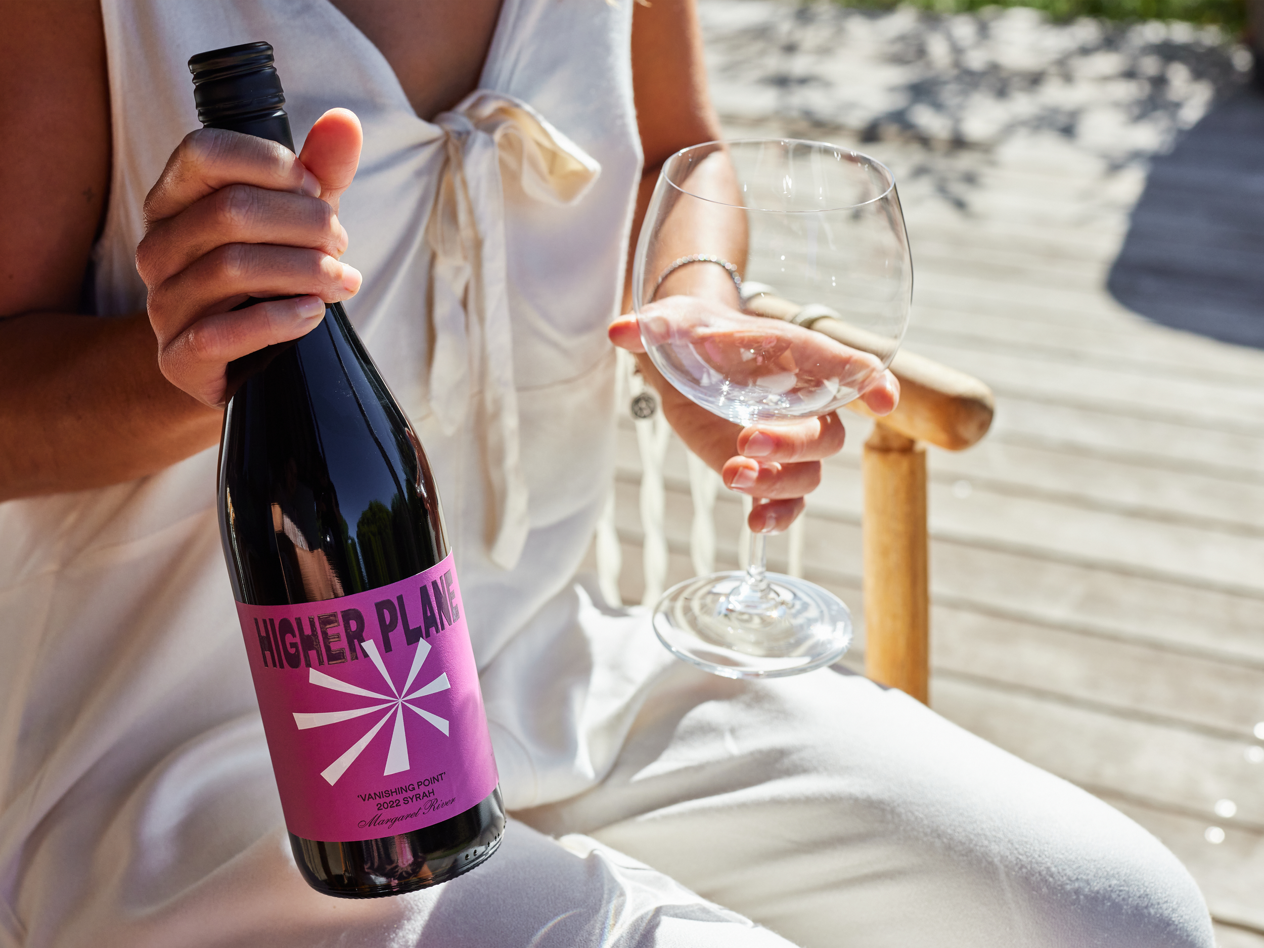
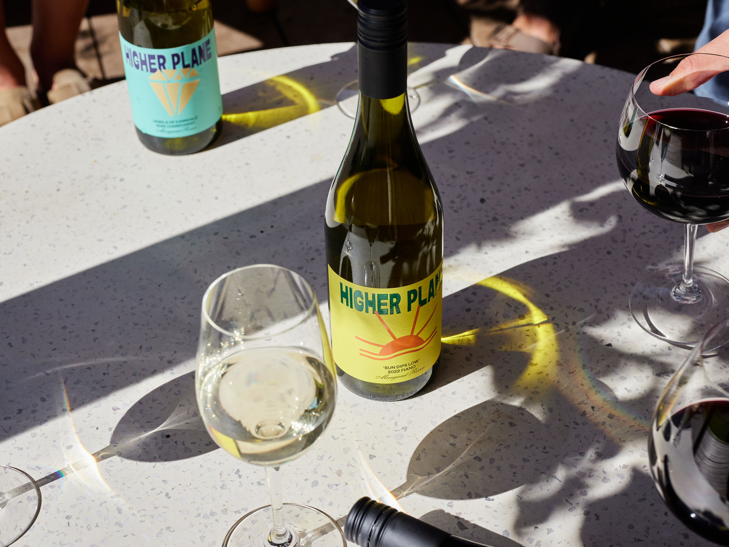
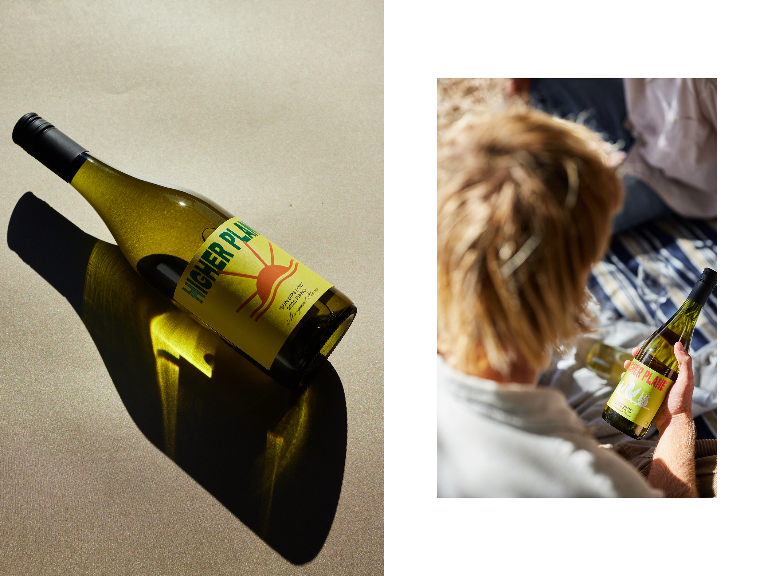
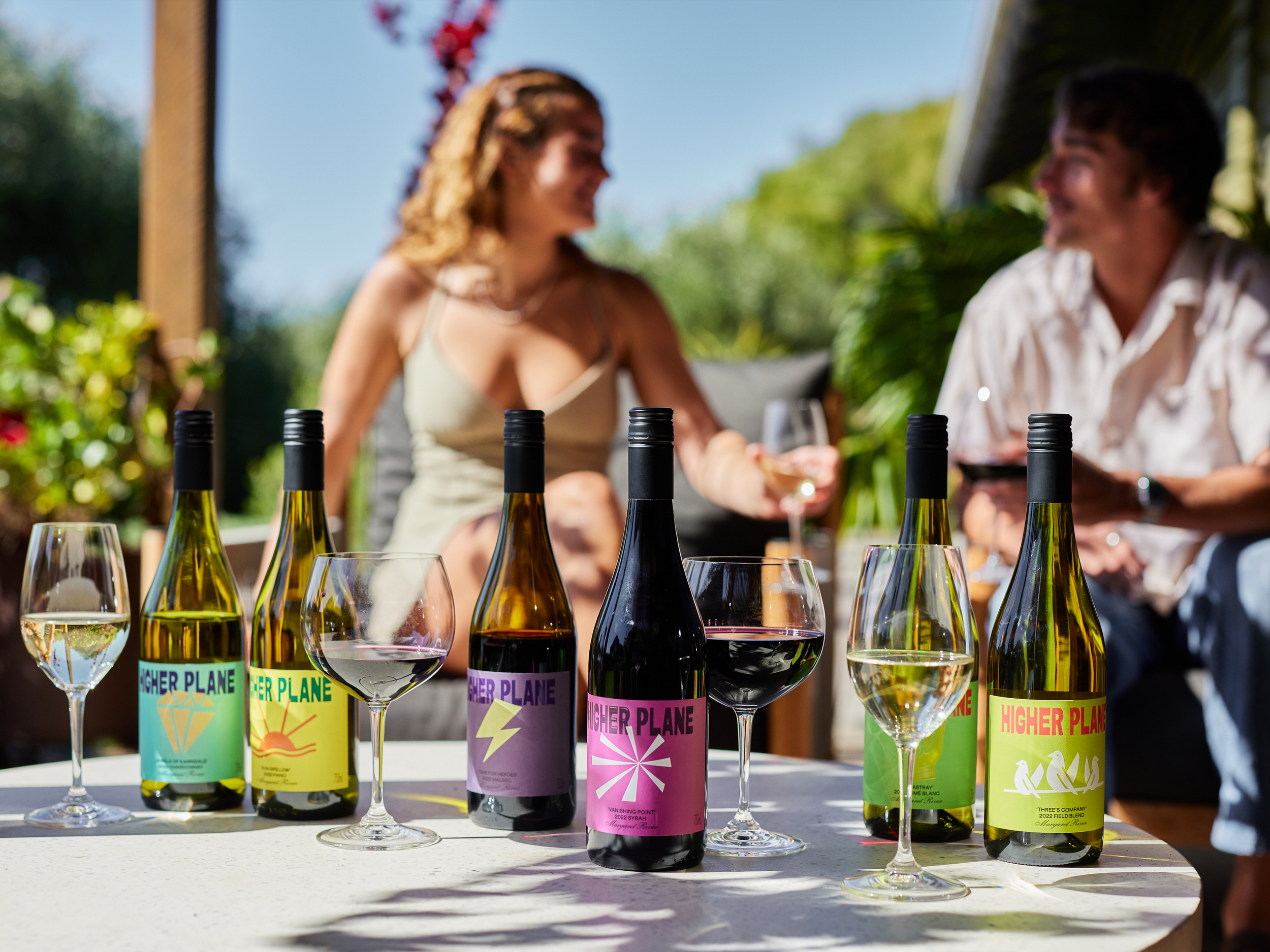
The new range is unapologetically bold, jumping off the shelf with bold use of colour, a contemporary hand-made approach to typography and unique wine names. Each wine has a name that describes the juice inside the bottle and an illustration to match. For example, 'Sun Dips Low' Fiano takes you to the backyard deck on a hot Summer's day with its image of the sun dropping below the horizon.
As a result of the rebrand, sales and the wines themselves are now hitting the spot.