Snake + Herring
When you have a really good nickname, you should milk it for all it’s worth. If that means joining forces with your other equally well-nicknamed mate and building an entire branding strategy around it for your new business, then so be it. And that’s what happened when Tony and Redmond (Snake and Herring respectively) launched their innovative wine venture back in 2011.
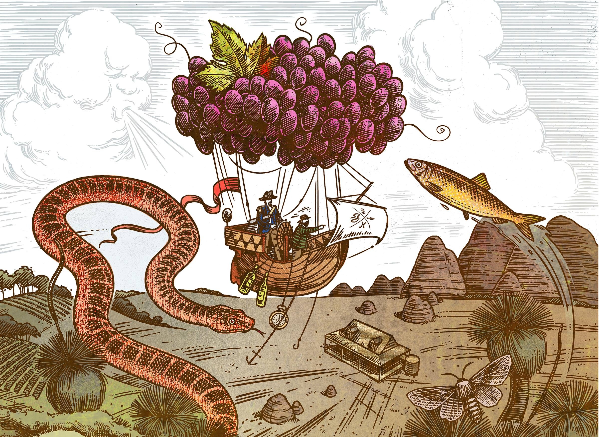

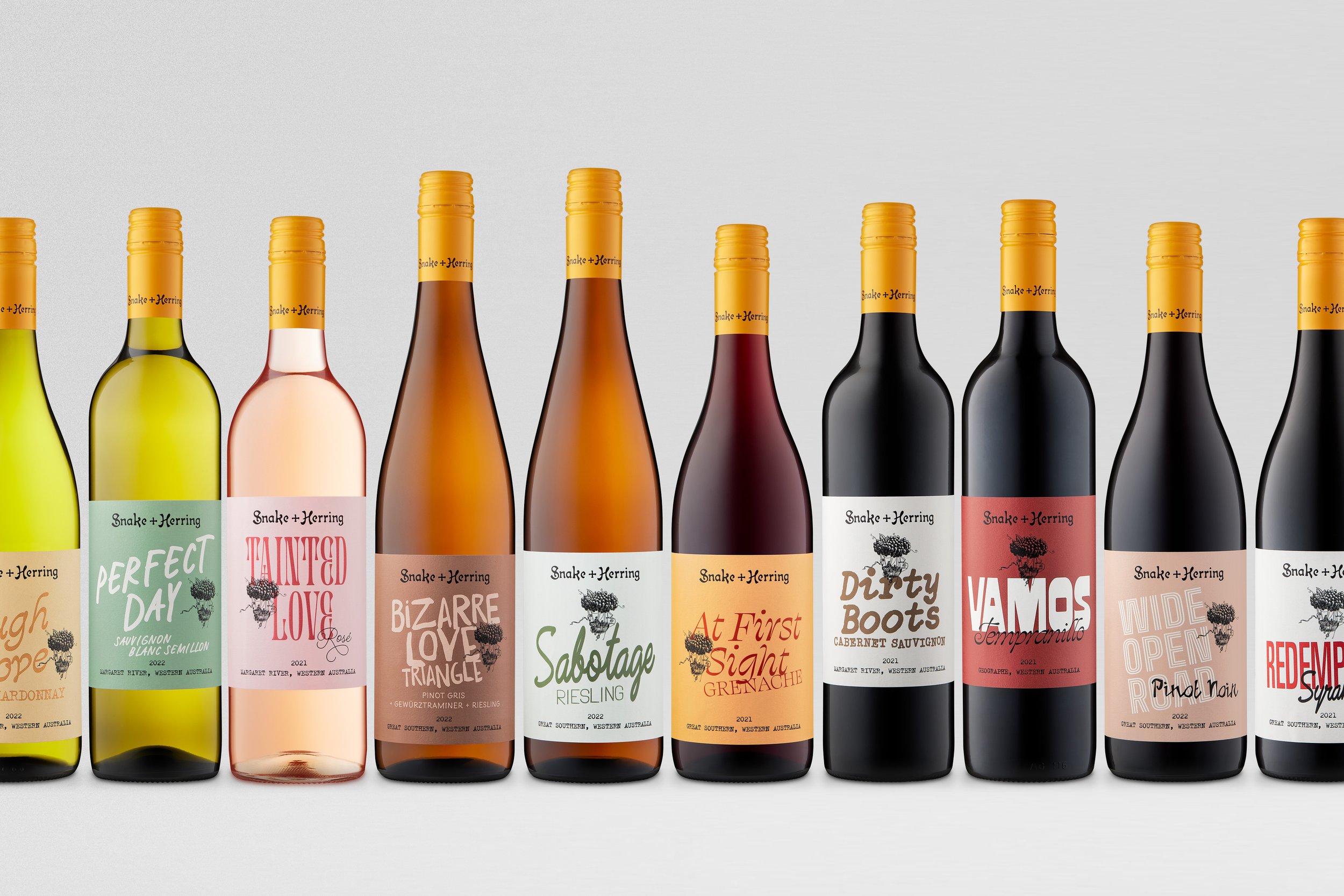
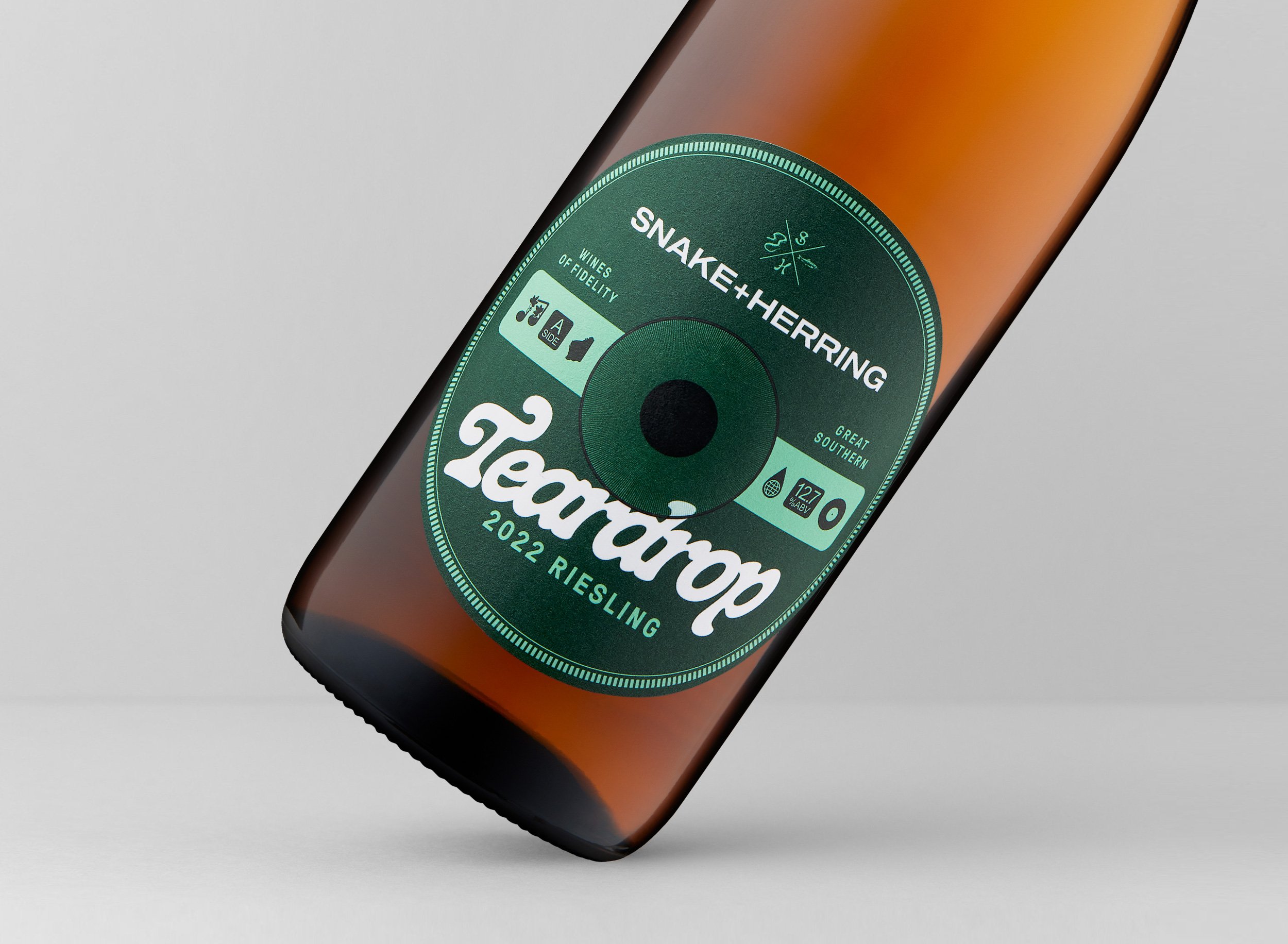
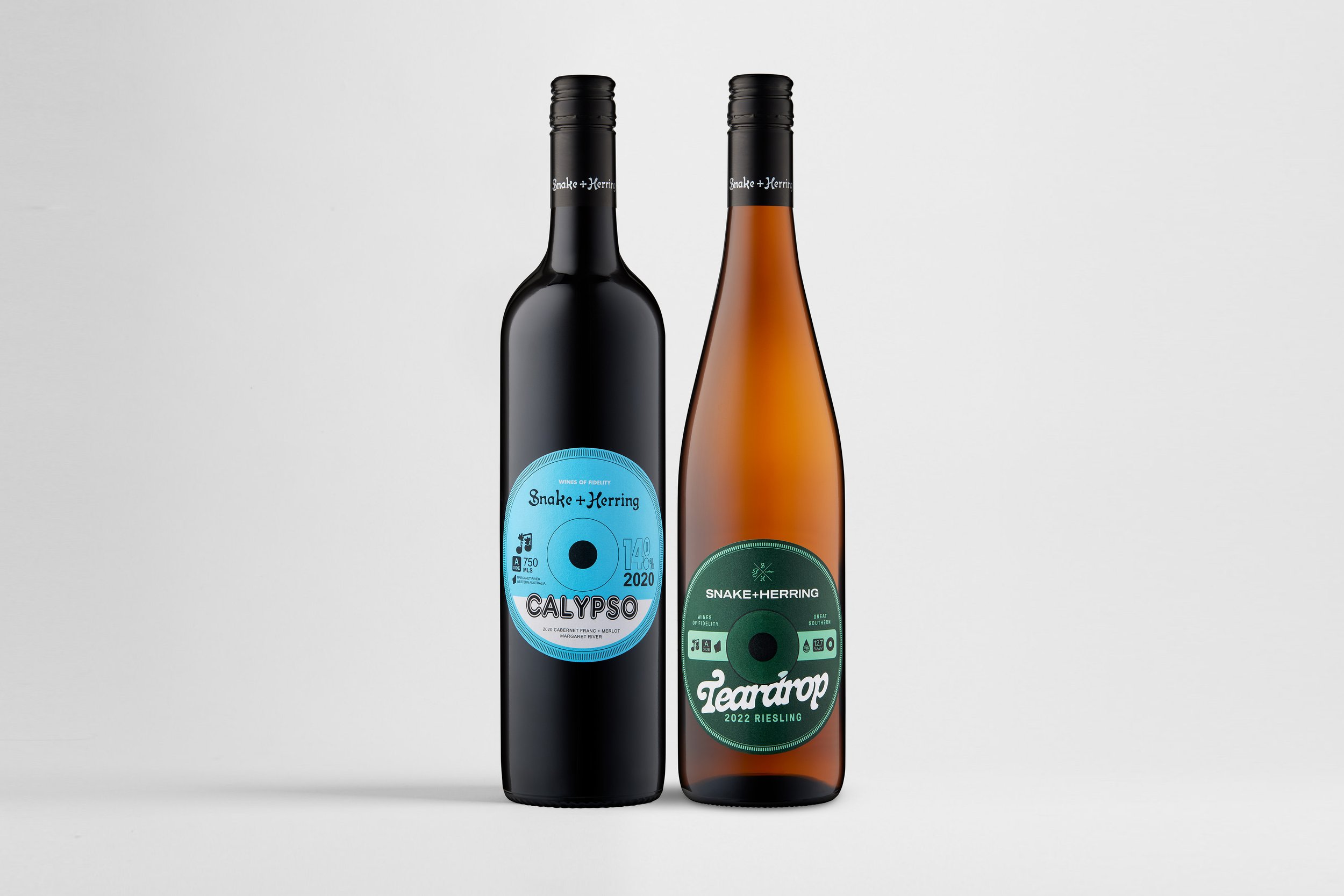
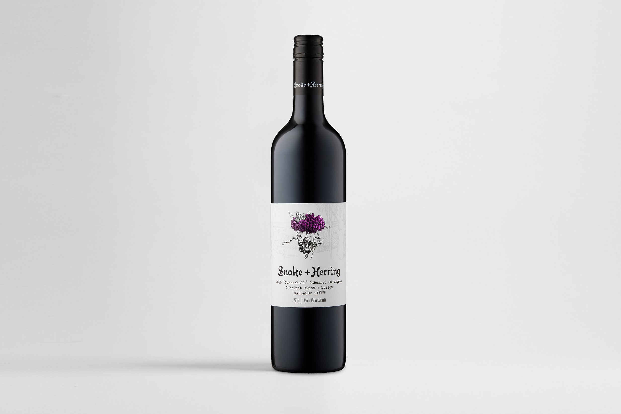
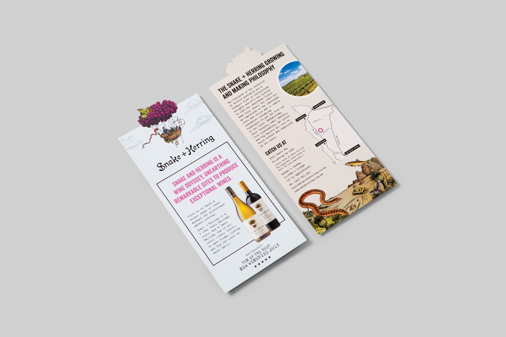

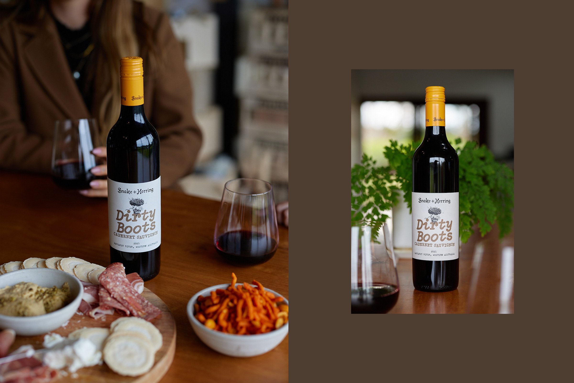
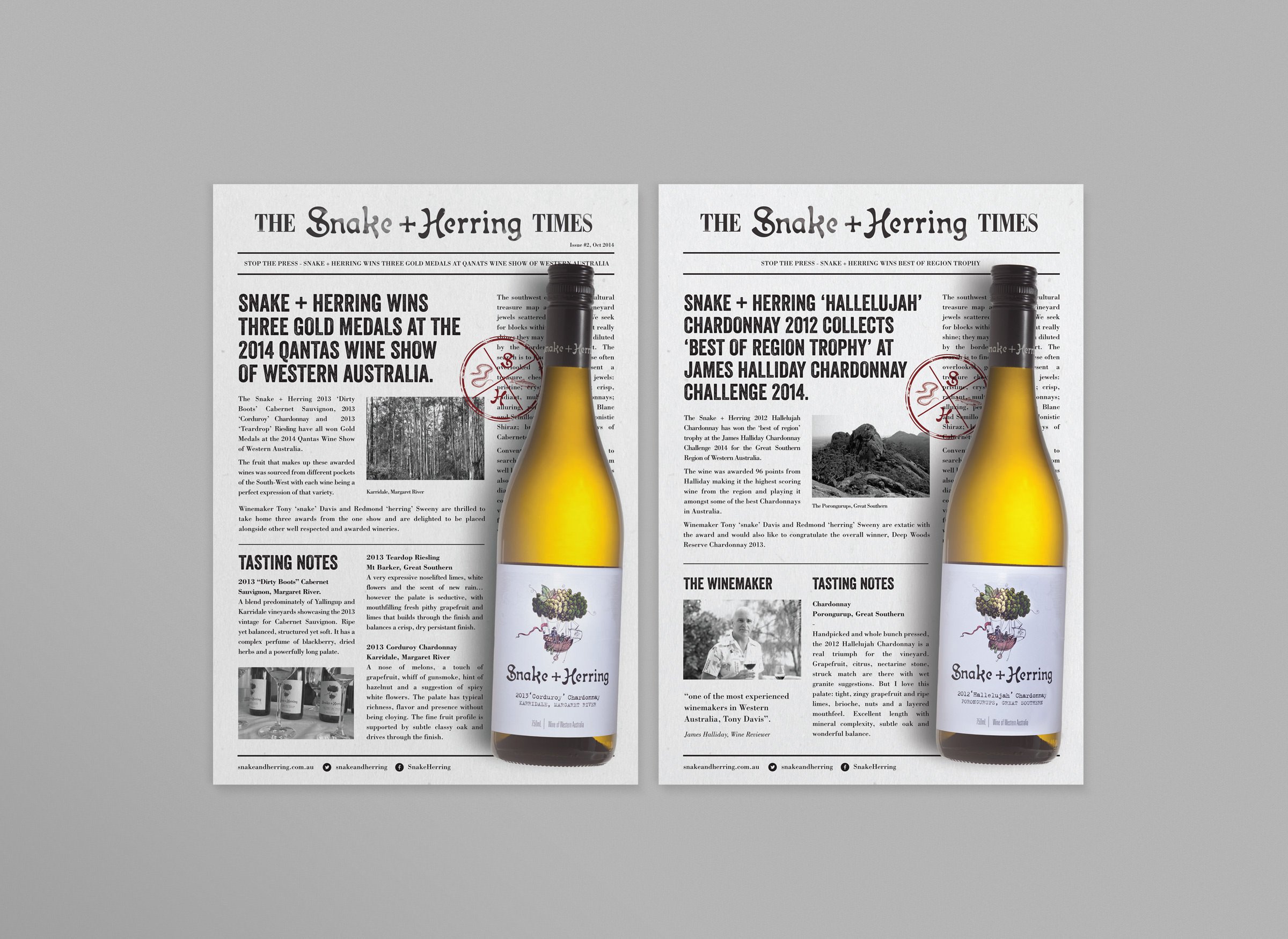

With a name like Snake + Herring, the guys required a strong, unique narrative that expressed their individuality and also described their brand story. The wine label features an illustration capturing the winemakers in a grape balloon being lead through the landscape by - you guessed it - a snake and a herring. The labels are finished with a number of printed embellishments that reflect the premium nature of this damn good wine.
Original label design completed as Senior Designer at braincells.
Website Development: Nathan Shanahan | Studio Photography: Foliolio | Illustration: Malcolm Lindsay
Finalist: QANTM CREATE Desktop Awards 2012